
Getting precise color matching is essential for designers, brands, and print professionals. The right shades ensure consistency across projects, from digital mockups to final prints.
In 2022, Adobe made a major change—removing free access to certain color libraries. Now, a $15/month subscription is required for accurate results. Outdated swatches can lead to mismatched hues, especially in legacy files.
This guide covers solutions for accessing reliable color tools post-update. You’ll learn how to avoid common pitfalls, like incorrect black replacements, and achieve professional-grade results.
We’re committed to being your trusted resource for color expertise. Stay tuned for upcoming expansions, including advanced tools like colorimeters.
Why Pantone Colors Matter for Designers
Before 1963, designers struggled with unpredictable color results. Printers used different ink mixtures, causing costly mismatches. The Pantone Matching System changed everything by creating standardized formulas.

CMYK can't match Pantone's precision. Four-color printing blends cyan, magenta, yellow, and black. This often creates variations across printers. Pantone uses pre-mixed inks for consistent results every time.
Industries relying on exact hues include:
- Fashion (matching fabric dyes)
- Product packaging (brand recognition)
- Corporate branding (logo consistency)
A single shade difference can make products look cheap. Major brands spend thousands to protect their signature colors. Pantone maintains over 2,100 standardized options for this purpose.
New tools like colorimeters will soon enhance accuracy further. While the system requires investment, it prevents expensive reprints. Compared to alternatives, Pantone offers unmatched reliability for professionals.
Design software like Photoshop and Illustrator integrate these colors. This ensures digital designs match physical prints perfectly. The subscription model helps maintain this precision across updates.
How to Access Pantone Colors in Photoshop
Designers need quick access to accurate hues for professional projects. Start by clicking the foreground swatch in the toolbar. This opens the color picker, where precision begins.
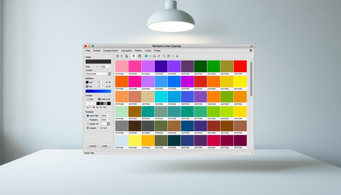
Next, select Color Libraries in the dialog box. Here, you’ll find Pantone books like *Solid Coated* and *Uncoated*. Each serves different purposes:
| Book Type | Use Case |
|---|---|
| Solid Coated | Glossy prints (business cards, brochures) |
| Solid Uncoated | Matte finishes (stationery, packaging) |
Type a number to jump to specific colors. For example, "Pantone 19-4052" fetches Classic Blue. Missing libraries? Update Adobe software or reinstall color books.
Save time by creating custom swatch groups. Drag frequently used shades into a new panel. Legacy files may show replacement warnings—double-check book selections to fix mismatches.
Pro Tip: Press F6 to toggle the toolbar swiftly. Always verify the book type matches your output medium for flawless results.
Understanding Pantone’s Adobe Subscription Model
Adobe’s shift to a paid model for color libraries surprised many designers. The $15/month fee replaced free access to Pantone books, sparking debates about workflow disruptions. This change reflects a broader partnership shift between Adobe and Pantone to monetize professional-grade tools.
Why does this matter? Legacy files now display black replacements if the original swatches are missing. The system defaults to black when it can’t find licensed color data. This affects branding consistency and print accuracy.
Workarounds exist for those avoiding subscriptions:
- Copy metadata from older files to restore swatches
- Use the Pantone Connect plugin for limited free access
- Export colors as CMYK values (less precise)
| Option | Cost | Best For |
|---|---|---|
| Adobe Subscription | $15/month | Teams needing consistent updates |
| Pantone Connect | Free (basic) | Freelancers with occasional needs |
| Manual CMYK Conversion | $0 | Low-budget projects |
Corporate licensing offers volume discounts for studios. For freelancers, the fee may outweigh benefits unless clients demand exact matches. Always link your software to the latest color books to avoid surprises.
Pro Tip: Test files in draft prints before final production. Black replacements often go unnoticed until it’s too late.
Tips for Using Pantone Colors Across Design Software
Efficient designers know how to bridge digital and physical color systems. Consistency matters whether you’re working in Adobe apps or preparing files for print. Follow these strategies to avoid mismatches and streamline workflows.
Start with the Pantone Connect plugin. It offers free access to essential swatches and syncs across devices. For teams, create master libraries in Illustrator or InDesign. Share these files to ensure everyone uses the same hues.
Always verify colors in final output. Soft proofs on screen differ from printed results. Use Pantone’s Digital Color Bridge to preview how shades render on materials like fabric or paper.
Automate repetitive tasks with batch updates. Sync physical swatch books to digital libraries for accuracy. New tools like colorimeters will soon make this even easier.
Set up client-proofing systems with notes on specific shades. Cross-reference swatches between Photoshop and Illustrator. This prevents last-minute surprises.
Pro Tip: Run pre-flight checks before sending files. Confirm all Pantone references use the correct book type. Small steps save big headaches later.
Conclusion
Mastering color accuracy ensures professional results across all projects. Follow these steps to stay ahead:
Update your tools regularly and use standardized swatches. Invest in reliable color systems to avoid costly mismatches. Our platform will soon introduce advanced matching tools for even better precision.
Pro Tip: Bookmark our resource link for quick access to updates. Small adjustments today save time and money tomorrow.