The power of color to influence our emotions and perceptions is undeniable. As Vassily Kandinsky once said, "Color is a power which directly influences the soul." This profound impact is precisely what the Pantone Institute leverages when announcing their Color of the Year each December.
The Pantone Color of the Year has become a significant event in the design world, influencing industries from fashion to marketing. Since its inception in 2000 with Cerulean Blue, the announcement has grown into a major cultural phenomenon. Each selected color embodies the mood and social climate of the coming year, offering valuable insights for designers and marketers.
For 2025, the chosen hue is Mocha Mousse, a warm, sophisticated brown tone that challenges perceptions and offers comfort. Understanding the significance and selection process of Pantone's Color of the Year can provide crucial insights into the world of design and beyond.
The Significance of Pantone's Color of the Year
The announcement of Pantone's Color of the Year is a highly anticipated event that shapes the color landscape across multiple sectors. This annual tradition has become a benchmark for design and color trends in various industries.

What is the Pantone Color Institute?
The Pantone Color Institute is the renowned authority behind the Color of the Year selection. It is a trusted source for color intelligence, providing insights that guide designers, brands, and industries in their use of color. The Institute's extensive research into color trends saves businesses countless hours of marketing research.
The Cultural Impact of the Annual Color Selection
The annual Color of the Year has grown into a cultural phenomenon, extending its influence far beyond the design world. It affects consumer products, from smartphones to fashion collections. Major brands eagerly await the announcement, often developing product lines and marketing campaigns that incorporate the chosen color to stay relevant and trendy.
The selection creates a ripple effect through social media, with designers, influencers, and brands showcasing creative applications of the color, generating buzz and engagement. By establishing this yearly tradition, Pantone has created a universal color language that connects diverse industries and consumers around a shared visual reference point.
The cultural impact of the Color of the Year demonstrates how color serves as a powerful communication tool that transcends language barriers and speaks to our collective emotional state, reflecting current trends and moods.
The History Behind Pantone's Color of the Year
Understanding the history of Pantone's Color of the Year requires a look into how this tradition began and evolved over time. The selection of the Pantone Color of the Year is a meticulous process that involves a committee of about 40 experts from the Pantone Color Institute.
Macro trends from around the world influence the decision, making it a comprehensive reflection of the global mood and direction.
Origins of the Color of the Year Tradition
The Color of the Year tradition began as an internal decision focused primarily on color trends in fashion and home décor. Over time, the selection process has grown more sophisticated, evolving into a global analysis involving extensive travel, trend analysis, and cross-industry collaboration.
The Pantone Color of the Year is typically announced in early December, allowing industries time to incorporate the color into their planning for the coming year. This strategic timing has become a crucial aspect of the process.
| Year | Color | Influencing Factors |
|---|---|---|
| Early 2000s | Various | Fashion, Home Décor |
| Recent Years | Varies | Technology, Social Movements, Environmental Concerns |
Evolution of the Selection Process
The selection process has expanded to consider influences from technology, social movements, environmental concerns, and global events. This evolution reflects Pantone's commitment to capturing the essence of the global cultural moment through color.
Occasionally, Pantone has broken its own rules, such as in 2016 and 2021 when they selected two colors instead of one, reflecting complex cultural moments that couldn't be expressed through a single hue.

As the process continues to evolve, it remains a significant event in the design world, influencing industries from fashion to graphic design.
How Pantone Chooses the Color of the Year
Behind the scenes of Pantone's Color of the Year announcement lies a meticulous process involving a team of color experts. These specialists spend the year studying trends in various areas, including fashion, marketing, social media, and even politics, to choose a color that is not just a random pick, but a powerful reflection of the current global culture.
The Selection Committee and Process
The Pantone Color Institute is at the heart of this process, comprising a group of color experts who are tasked with the responsibility of selecting the Color of the Year. This team embarks on a comprehensive journey, analyzing trends and influences from around the world. Their research is thorough, covering a wide range of fields to ensure that the chosen color is a true representation of the current cultural landscape.
The process is not just about picking a color; it's about understanding the nuances of global trends and how they impact our perception of color. The team considers various factors, from socio-political events to technological advancements, to make an informed decision.
Factors That Influence the Decision
Several key factors influence the Pantone Color Institute's decision when selecting the Color of the Year. These include global socio-political events, economic conditions, technological advancements, environmental concerns, and cultural movements.
- Global socio-political events play a significant role, with Pantone often choosing hues that either provide comfort during turbulent times or express collective emotions about world events.
- Economic conditions also impact the decision, with reassuring colors chosen during recessions to offer stability, or vibrant hues to provide escapism and optimism.
- The influence of technological advancements is evident in the consideration of digital aesthetics and emerging technologies like virtual reality.
- Environmental concerns and sustainability movements have led to the selection of nature-inspired hues, reflecting our growing awareness of ecological issues.
- Cultural movements and shifts in identity politics also factor into the decision, with colors sometimes chosen to represent inclusivity, diversity, or changing social attitudes.
To illustrate the impact of these factors, let's examine a few examples:
| Year | Color of the Year | Influencing Factors |
|---|---|---|
| 2016 | Rose Quartz and Serenity | Cultural movements, blurring of gender norms |
| 2020 | Classic Blue | Economic uncertainty, need for stability |
| 2023 | Viva Magenta | Technological advancements, influence of digital world |
The Pantone Color Institute's selection process is a complex, multi-faceted approach to identifying the Color of the Year. By considering a wide range of global trends and influences, they choose a color that not only reflects the current cultural landscape but also inspires creativity and innovation.
The Psychology Behind Pantone Color of the Year
As Vassily Kandinsky once said, "Color is a power which directly influences the soul." This profound statement underscores the significant emotional and psychological impact of colors on human experience. Pantone's Color of the Year selection is more than just a design trend; it's a reflection of the current cultural and emotional landscape.
The Pantone Color Institute carefully considers how different hues and colors influence our emotional state and cultural moods. For instance, certain colors can trigger specific neurological responses and emotional reactions. Blues tend to calm and soothe, while reds energize and excite. Earth tones, such as the recently selected Mocha Mousse, create feelings of stability and comfort.
Cultural Moods and Color Reflections
Colors have the ability to reflect and influence cultural moods. The emotional impact of Pantone's yearly selections extends beyond aesthetic preference, affecting our sense of wellbeing, stress levels, and even purchasing decisions. Research indicates that emotional responses to colors are partly universal and partly culturally conditioned, a nuance that Pantone considers when selecting a color with global appeal.
| Color | Emotional Response | Cultural Significance |
|---|---|---|
| Blues | Calm, Soothing | Trust, Stability |
| Reds | Energizing, Exciting | Passion, Urgency |
| Earth Tones (e.g., Mocha Mousse) | Comforting, Stable | Warmth, Comfort |
The Emotional Impact of Color Choices
The sensory experience of color creates powerful associations. For example, Mocha Mousse evokes the comforting warmth of coffee and chocolate, triggering positive emotional responses tied to those experiences. By understanding the emotional impact of colors, Pantone creates a shared emotional vocabulary that helps people articulate and process collective feelings about our changing world.
The selection of a particular hue can influence our tone and sense of desire. As such, Pantone's Color of the Year is not just a color but a reflection of our collective sense of style and emotional state.
A Chronological Journey Through Pantone's Colors of the Year
Pantone's Color of the Year has evolved into a cultural touchstone, capturing the essence of the zeitgeist. This annual selection has not only influenced design and color trends but has also served as a mirror to societal moods and trends. Let's embark on a chronological journey through the Colors of the Year, exploring the significant hues that have defined the past two and a half decades.
The Early Years: 2000-2010
The early 2000s saw the introduction of Pantone's Color of the Year, with selections that reflected the era's aesthetic and cultural inclinations. Although specific colors from this period are not detailed in the provided data, it's worth noting that this era laid the groundwork for the significance of Pantone's annual color selection. As design trends evolved, so did the influence of Pantone's Color of the Year.
One of the notable colors from this era is Cerulean Blue (2000), which symbolized the optimism at the turn of the millennium. The subsequent years saw a variety of colors, each with its unique story and cultural relevance.
The Middle Era: 2011-2020
The period between 2011 and 2020 was marked by diverse and sometimes provocative color selections. For instance, Radiant Orchid (2014) and Rose Quartz (2016) were among the colors that stood out, reflecting changing societal values and aesthetics. Radiant Orchid, with its vibrant and playful tone, symbolized creativity and experimentation, while Rose Quartz represented a softer, more nurturing side of culture.
These selections underscored Pantone's ability to capture the mood of the times, influencing not just design but also broader cultural narratives.
Recent Selections: 2021-2025
The recent years have seen Pantone's Color of the Year continue to reflect and influence global culture. The selections from 2021 to 2025 have been particularly noteworthy, given the global context of the pandemic and subsequent recovery.
In 2021, the dual selection of Ultimate Gray and Illuminating symbolized resilience and hope. The following year, Very Peri (2022) was introduced as a completely new shade, representing innovation and the evolving digital landscape.
"The color Very Peri is a symbol of the global transformation we are living through. It's a new reality where digital and physical realities are merging."
The subsequent years saw the introduction of Viva Magenta (2023), a vibrant and balanced color that encouraged self-expression, and Peach Fuzz (2024), a soft and nurturing hue that emphasized community and tenderness.
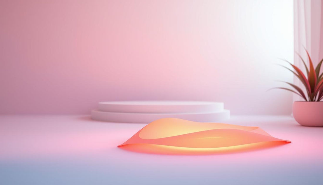
The latest selection, Mocha Mousse (2025), represents a sophisticated evolution of earth tones, elevating brown to an aspirational and luxurious status. This reflects our collective desire for comfort with elegance, as noted by Pantone.
- The pandemic era began with a dual color selection, symbolizing strength and hope.
- Very Peri marked a historical first as a newly created color, representing innovation.
- Viva Magenta brought vibrant energy, balancing digital and natural worlds.
- Peach Fuzz offered a gentle transition, emphasizing community and human connection.
- Mocha Mousse represents a sophisticated evolution of earth tones, reflecting a desire for comfort and elegance.
Spotlight on 2025: Mocha Mousse
With the announcement of Mocha Mousse as the Color of the Year for 2025, Pantone continues its tradition of selecting tones that reflect current cultural moods. This warm, earthy hue is expected to have a significant impact on various design industries.
Mocha Mousse is more than just a color; it's a reflection of the current cultural landscape. It signifies a shift towards warmth and comfort in design, moving away from the cooler tones that have dominated recent years.
The Significance of Mocha Mousse
Lauren Battistini, a respected color expert, shared her insights with HuffPost, stating,
"It's a clear indicator that the fashion, home, interiors, and other industries are shifting to something with more comfort, warmth, and earthy appeal."
This sentiment is echoed by many in the design community, who see Mocha Mousse as a versatileshadethat can be paired with a variety of colors to create visually appealing palettes.
The tone of Mocha Mousse is particularly noteworthy for its ability to serve as an "anchoring neutral," according to Battistini. It can be combined with colors such as cream, aqua, ochre, and warm greens to create a harmonious visual experience.
Reactions from the Design Community
Experts in the field have offered mixed but predominantly positive reactions to Mocha Mousse. Some have noted that the selection is a natural evolution from the cooler palettes of recent years, while others have pointed out its potential as a sophisticated alternative to gray neutrals in home décor.
A closer look at the reactions reveals a common theme: the appreciation for Mocha Mousse's warmth and versatility. The following table summarizes some of the key points made by design professionals:
| Expert | Reaction |
|---|---|
| Lauren Battistini | Sees Mocha Mousse as a versatile "anchoring neutral" that pairs well with diverse colors. |
| Jacob Cass | Initially questioned the selection but acknowledged its potential power. |
| Interior Design Professionals | Enthusiastic about Mocha Mousse as a sophisticated alternative to gray neutrals. |
The selection of Mocha Mousse as the Color of the year 2025 is a significant indicator of the design industry's shift towards warmer, earthier tones. As seen in the image below, Mocha Mousse embodies a sense of comfort and warmth.
As the design community continues to react and adapt to this new color, it's clear that Mocha Mousse will play a significant role in shaping the aesthetic of 2025.
How Industries Incorporate the Color of the Year
The Color of the Year announcement by Pantone triggers a chain reaction, with multiple industries reimagining their products and designs around the chosen color. This phenomenon is not just about adopting a new color; it's about understanding the cultural and emotional resonance it carries.
As the Color of the Year influences various sectors, let's explore how different industries incorporate this trend into their work.
Fashion and Apparel
Fashion designers eagerly await Pantone's Color of the Year to inspire their next collections. The chosen color often becomes a central theme, influencing everything from clothing and accessories to footwear. Designers incorporate the color into their designs through various techniques, such as dyeing fabrics, creating color-blocked patterns, or using the hue as an accent.
Interior Design and Home Décor
Interior designers and home décor brands also capitalize on the Color of the Year trend. They create products and spaces that reflect the mood and aesthetic of the chosen color. For instance, if the Color of the Year is a warm, earthy tone, designers might focus on natural materials and textures that complement this hue.
Graphic Design and Marketing
Graphic designers and marketers use Pantone's Color of the Year to refresh branding and advertising campaigns. The new color can be incorporated into logos, packaging, and promotional materials to give them a modern and trendy look. This helps brands stay relevant and capture the attention of their target audience.
Beauty and Cosmetics
The beauty and cosmetics industry is particularly responsive to Pantone's Color of the Year. Makeup companies create limited-edition collections featuring products in the trending color. For example, with Mocha Mousse as the Color of the Year, beauty brands might develop a range of eyeshadows, lipsticks, and nail polishes in various shades of mocha. Hair color trends are also influenced, with stylists incorporating subtle hints of the color into their techniques.
| Industry | Ways to Incorporate Color of the Year | Example |
|---|---|---|
| Fashion and Apparel | Dyeing fabrics, color-blocking, accent colors | Designing a collection around Mocha Mousse |
| Interior Design and Home Décor | Using natural materials, complementary textures | Creating a Mocha Mousse-themed living room |
| Graphic Design and Marketing | Refreshing branding, packaging, promotional materials | Updating a brand's logo to feature Mocha Mousse |
| Beauty and Cosmetics | Limited-edition collections, hair color trends | Developing a Mocha Mousse eyeshadow palette |
By incorporating Pantone's Color of the Year, industries not only stay on-trend but also tap into the cultural zeitgeist, creating products and designs that resonate with consumers.
Business Strategies Using Pantone's Color of the Year
Businesses worldwide are leveraging Pantone's Color of the Year to drive their marketing strategies and product development. The extensive color trending research done by the Pantone Color Institute saves companies countless hours of marketing research. When the new color is announced in December, businesses should look into how it can be incorporated into their marketing and product creation strategies.
The Color of the Year is meant to be used for marketing and product creation, not necessarily a rebranding. Forward-thinking companies begin product development around the Color of the Year months before its public announcement, working with Pantone under confidentiality agreements to gain a competitive advantage.
Marketing Campaigns Inspired by the Color of the Year
Marketing campaigns are significantly influenced by the Color of the Year. Companies use the selected color to create cohesive and engaging campaigns across various platforms, including social media. By incorporating the Color of the Year into their branding, businesses can make their marketing efforts feel current and relevant.
- Brands create special social media challenges and contests that encourage users to share content featuring the Color of the Year.
- Influencer partnerships are formed to showcase products or experiences that highlight the new color trend.
- Companies refresh their visual identity on social media platforms to align with the Color of the Year, making their brand presence more vibrant and engaging.
Product Development Around Annual Color Trends
Product development is another area where the Color of the Year has a significant impact. Product designers create special editions, limited releases, and seasonal variations that incorporate the Color of the Year, refreshing existing product lines without complete redesigns.
The timing of product launches is strategically aligned with the Color of the Year announcement, allowing brands to capitalize on the media attention and consumer interest that surrounds the reveal. Companies across diverse industries—from technology to food and beverage—find creative ways to incorporate the color trend, even when their products aren't traditionally color-focused.
Key strategies include:
- Creating limited-edition products that feature the Color of the Year.
- Aligning product launch dates with the announcement of the Color of the Year to maximize marketing impact.
- Using the Color of the Year in packaging and branding to make products stand out in the market.
Consumer research shows that products featuring the Color of the Year often perform better in the marketplace, particularly among design-conscious consumers who value staying current with visual trends.
Pantone Color Systems and Tools for Designers
Since 2013, Pantone has been providing designers with the tools and color systems needed to incorporate the Color of the Year into their work. This comprehensive suite of resources enables creative professionals to accurately reproduce and apply the chosen color across various mediums and applications.
The Pantone Color System is designed to facilitate the translation of color inspirations into physical and digital products. Graphic designers, fashion designers, makeup designers, interior decorators, and product manufacturers all rely on Pantone's tools to create new and trending products and graphics featuring the Color of the Year.
Understanding Pantone Color Codes
Pantone's color coding system is fundamental to its design tools. The Pantone Formula Guide is an essential resource for graphic designers and printers, providing solid color chips with corresponding ink formulations for accurate color reproduction. Additionally, Pantone's Color Bridge guides help designers translate Pantone colors to their CMYK, RGB, and HTML equivalents, ensuring consistent color representation across print and digital applications.
Essential Pantone Tools for Creative Professionals
Pantone offers a range of tools that cater to different aspects of design. The Pantone Connect digital platform integrates seamlessly with design software like Adobe Creative Cloud, allowing designers to access and apply Pantone colors directly within their workflow. Fashion and textile designers benefit from Pantone's Fashion, Home + Interiors (FHI) Color System, which provides color standards specifically formulated for textiles, paints, and interior materials. Furthermore, tools like the Pantone Color Finder and Pantone Studio mobile app enable designers to reference color codes, capture, create, and share Pantone color palettes on the go.
Ametra's Approach to Color Solutions
With its unique blend of color expertise and project management technology, Ametra is transforming the construction and design industries. The Ametra App is specifically designed for construction and home renovation contractors, aiming to revolutionize project management.
Ametra's innovative approach combines color planning with project management, making it easier for professionals to achieve their design goals. The app features specialized color management tools that help contractors and designers track color specifications, manage client approvals, and maintain color consistency throughout projects.
Professional Color Management Tools
The Ametra App includes integration with Pantone color libraries, enabling teams to reference exact color codes, create project-specific palettes, and share accurate color information with clients and vendors. This ensures that all stakeholders are on the same page regarding color year trends and other design elements.
- Track color specifications and manage client approvals efficiently.
- Create and share project-specific colors palettes with ease.
- Maintain color consistency throughout the project lifecycle.
Streamlining Project Management with Color Trends
Ametra's dual expertise in project management and design creates a streamlined experience for professionals who need to manage both the technical and aesthetic aspects of their projects. The app's color visualization features allow clients to preview how Color of the Year and other trending hues will look in their spaces before committing to final selections.
By integrating color planning into project management, Ametra simplifies every aspect of project execution, from task scheduling and resource allocation to real-time collaboration and progress tracking. This comprehensive approach makes Ametra an invaluable tool for professionals in the media and design industries.
Conclusion: The Lasting Influence of Pantone's Color of the Year
Since its introduction, the Pantone Color of the Year has become an eagerly anticipated event that captures the essence of our times. Over the years, it has evolved from a simple industry forecast to a global cultural phenomenon that influences billions of dollars in consumer products and design decisions.
The annual color selection serves as both a reflection of our collective mood and an influencer of it, creating a fascinating feedback loop between color trends and cultural experiences. This phenomenon has not only commercial impact but also educational value, teaching consumers about color psychology and helping them develop a more sophisticated understanding of how colors affect our emotions and behaviors.
As we look to the future, the Pantone Color of the Year will likely continue to evolve, potentially incorporating more technological elements like augmented reality experiences or sustainable color production methods. The enduring legacy of this tradition lies in how it connects diverse industries and individuals around a shared visual language, reminding us that even in our increasingly digital world, color remains one of our most powerful and universal forms of communication.