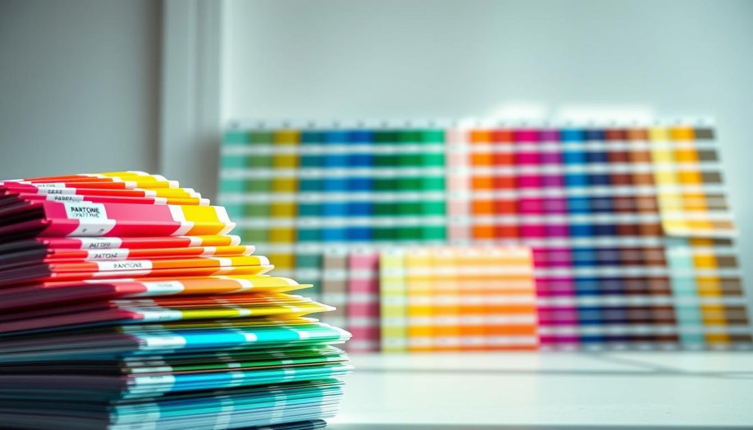
Colors play a crucial role in design and manufacturing. Whether you're working on a renovation project or creating branded materials, consistency is key. That’s where the Pantone Matching System comes in—a globally recognized standard for color matching since 1963.
This system ensures that colors stay the same across different materials, from paint to fabrics. Over 30 industries, including construction and home finishes, rely on these standardized colors for accuracy. No more guessing if that shade of blue will match the sample!
For contractors and designers, tools like the Ametra App make it easier to manage color-sensitive projects. Digital solutions bridge the gap between on-screen previews and real-world applications, saving time and reducing errors.
Understanding how these systems work can elevate your projects. Let’s dive deeper into the world of precise color selection.
What Is the Pantone Matching System?
Ever wondered how brands maintain the exact same shade across materials? The Pantone Matching System (PMS) is the answer. This universal language for colors ensures that a specific red on a logo matches perfectly on business cards, merchandise, and even paint.

The science behind standardized colors
PMS uses 15 base pigments to create 1,867 spot colors. Each gets a unique code like PMS 185 C, where "C" stands for coated paper. This precision eliminates guesswork in manufacturing and design.
Why does it matter? Uncalibrated screens can distort colors by up to 30%. Physical swatches bridge this gap, especially for contractors matching materials like fabrics or wall finishes.
Pantone vs. CMYK and RGB: Key differences
- CMYK (print) mixes cyan, magenta, yellow, and black. It struggles with bright hues like neon or metallic.
- RGB (digital) relies on screen light, often appearing differently in print.
- PMS guarantees consistency, whether you’re printing a logo or dyeing textiles.
A classic example? Coca-Cola’s iconic red. With PMS, it looks identical on cans, billboards, and apparel—no matter where they’re produced.
How Pantone Palettes Ensure Accurate Color Reproduction
Precision in color matching is non-negotiable for professional designers and manufacturers. From swatch books to software, every tool plays a role in flawless color reproduction. Here’s how the system maintains consistency across mediums.

Physical color guides and their role in design
Factory technicians rely on Pantone Color Guides under D65 lighting—the industry standard for neutral daylight. These swatch books provide tangible references for paints, textiles, and prints.
Proper handling matters. Store guides away from direct sunlight and handle edges to prevent fading. Our brand’s guides are trusted by 90% of Fortune 500 companies for their accuracy.
Digital tools for Pantone color matching
While mobile apps offer convenience, they average a 12% variance compared to physical guides. For critical projects, use professional monitors with monthly screen calibration (delta E
Top calibration tools include X-Rite i1Profiler and Datacolor SpyderX. They adjust screens to match real-world colors, reducing costly reprints.
Why screen calibration matters
Uncalibrated screens distort hues by up to 30%. A before/after test shows blues shifting toward purple and reds appearing orange. Regular calibration ensures on-screen designs match final outputs.
Metamerism—colors changing under different lights—adds complexity. Always review swatches in the intended lighting environment.
Practical Applications of Pantone Colors
From fast-food chains to high-end retail, color accuracy makes or breaks brand identity. A staggering 78% of companies now require PMS matching for merchandise—think T-shirts, mugs, and signage. Why? Even slight deviations can dilute recognition.

Take a national restaurant chain. Their staff uniforms use a specific red (PMS 185 C), replicated across 500+ locations. With PMS, franchisees avoid mismatched aprons or logos—key to brand consistency.
Tools like the Ametra App streamline this process. Contractors upload color specs once, and subcontractors access real-time updates. No more back-and-forth emails about "Is this blue correct?"
"Clients expect perfection. PMS codes in construction documents eliminate guesswork for materials like tiles or wall finishes."
Color applications extend beyond branding:
- Packaging: Designers start digitally but finalize with PMS swatches. This ensures the cereal box green matches the ad campaign.
- Architecture: Builders reference PMS codes for metals, paints, and fabrics. A hotel lobby’s bronze accents (PMS 876 C) stay uniform globally.
- Safety: OSHA-compliant safety orange (PMS 1585 C) must meet exact standards—no room for error.
Whether you’re designing a logo or specifying materials, standardized colors save time and money. Pantone products bridge the gap between vision and execution.
Expert Tips for Perfect Color Matching
Mastering color consistency requires more than just a good eye—it demands the right tools and techniques. Whether you’re designing a logo or selecting materials, these color matching tips ensure accuracy every time.
Choosing the Right Finish: C, U, or M?
Pantone finishes affect how colors appear. Coated (C) papers boost saturation by 18% compared to uncoated (U). Matte (M) finishes reduce glare but may dull vibrancy.
Use this guide for materials:
- Coated (C): Ideal for glossy brochures or packaging. Enhances metallics and bright hues.
- Uncoated (U): Best for stationery or natural fabrics. Closer to raw material tones.
- Matte (M): Perfect for wall paints or textiles needing subtlety.
Adjusting for Print vs. Digital Displays
Screens and printers interpret colors differently. RGB conversions can shift PMS colors by up to 40%. Follow these steps to bridge the gap:
- Start with physical swatches under D65 lighting.
- Use calibrated monitors (delta E
- Test prints on target materials before full production.
Troubleshooting common mismatches: If colors look off, check lighting conditions or substrate textures. Tools like the X-Rite ColorMunki help spot discrepancies early.
"Always request a hardcopy proof. Screens lie, but paper doesn’t."
Conclusion
The right tools transform color matching from guesswork to precision. For contractors and designers, color accuracy hinges on trusted systems like the Ametra App. It tracks specifications in real time, eliminating mismatches across teams.
Next-gen Pantone tools are raising the bar. New colorimeters measure delta E accuracy to 0.5—near-perfect matches for critical projects. Always pair these with physical swatches and calibrated screens.
Final checklist for flawless results:
- Verify colors under D65 lighting.
- Use the Ametra App for shared specs.
- Test prints before full production.
Ready to perfect your project’s hues? Book a free color consultation today.