Reflecting on the top color trends of 2024, it's clear that the year was marked by a diverse range of expressive hues. From Charli xcx's Brat Green to Pantone's Peach Fuzz, certain colors dominated the runways and retail.
Selecting the right seasonal colors is crucial for creating successful fashion collections. Understanding both timeless color principles and emerging trends is essential for designers and brands.
This guide will walk you through the process of choosing optimal seasonal colors for your collections, ensuring they resonate with consumers and stand out in the market.
Understanding the Psychology of Color in Fashion
In the world of fashion, colors are not just aesthetically pleasing but also carry emotional and psychological weight. The influence of color on consumer behavior is a critical aspect that designers must consider when creating their collections.
How Colors Influence Consumer Behavior
Colors evoke specific emotional and psychological responses in consumers. For instance, warm tones like red and orange can create feelings of energy and excitement, while cool blues and greens promote calmness and trust. Studies have shown that up to 85% of shoppers cite color as the primary reason for buying a particular product, highlighting the significant influence of color on consumer purchasing decisions.
The Seasonal Color Cycle
The seasonal color cycle in fashion follows both natural seasonal shifts and cultural movements. For example, spring typically features lighter, brighter hues while fall embraces richer, deeper tones. Color forecasting agencies like Pantone play a crucial role in establishing seasonal color trends, releasing color reports that influence designers worldwide.

Understanding how colors move through fashion cycles helps designers anticipate upcoming trends and position their collections strategically in the market. This knowledge enables them to create collections that resonate emotionally with their target audience, ultimately driving consumer engagement and sales.
Decoding Current Fashion Color Trends
As we dive into the world of fashion color trends for 2025, it becomes clear that this season is an exception to the usual dominance of a single hue. The traditional trickle-down effect from high-runways to mainstream retail is still observed, but with a twist.
The data indicates that while cultural phenomena, like the "Barbie pink" trend, significantly impact color trends, this season's palette is more diverse.
How Runway Colors Trickle Down to Retail
The journey of a fashion trend from the runways to retail involves several stages. Luxury brands introduce new shades, which are then adapted by mid-range and mass-market retailers, making the trend more accessible over time.
Cultural Influences on Color Popularity
Cultural phenomena and global events play a crucial role in shaping color trends. The influence of social media has accelerated this process, with platforms amplifying certain hues and creating viral moments that brands must respond to quickly.
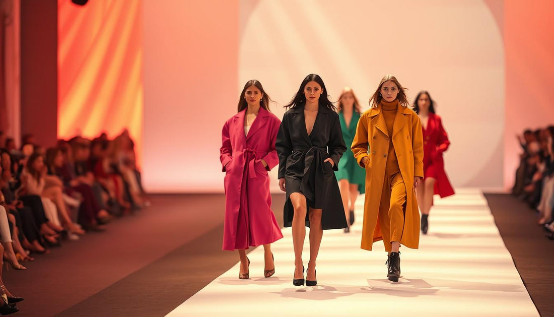
Top Seasonal Colors for 2025 Collections
As we step into 2025, the fashion industry is witnessing a vibrant shift in color palettes. Designers are introducing fresh hues that are both stylish and versatile, catering to diverse consumer preferences.
Spring/Summer Palette: Butter Yellow and Wispy Pink
The Spring/Summer 2025 palette is highlighted by butter yellow, a soft yet impactful hue that graced runways in sumptuous suede at Chloé and as minimalist draped dresses at Toteme. Pairing it with black adds a tough, grounding feel to this otherwise feminine color. Wispy pink is another standout, evolving from the Barbie-inspired hot pinks of previous seasons into a sophisticated, ethereal shade presented by designers like Alaïa and Khaite.

Fall/Winter Forecast: Mocha Mousse and Cardinal Red
For Fall/Winter 2025, Mocha Mousse, Pantone's color of the year, takes center stage as a rich, versatile brown shade. It works across various textures, from suede to jersey, and appeared in collections from Miu Miu, Lemaire, and Gucci. Cardinal red offers a sophisticated alternative to bright scarlet tones, providing depth and warmth to Fall/Winter collections.
Year-Round Neutrals: Cashew Milk and Inky Midnight
Year-round neutrals are evolving beyond basic beige. Cashew Milk emerges as 2025's quintessential not-quite-white-not-quite-beige shade, creating an elegant foundation for any seasonal wardrobe. Inky Midnight, a deep blue with purple undertones, is positioned to become the new alternative to black, offering similar versatility with added depth.
Tools for Professional Color Selection

In the world of fashion, color is a critical element, and professionals need reliable tools to get it right. Professional color selection requires specialized tools that ensure accuracy and consistency across the entire fashion design and production process.
Pantone Color Guides and Their Applications
Pantone Color Guides remain the industry standard for fashion designers, providing physical color references that help maintain consistency from concept to production. The Fashion, Home + Interiors (FHI) Color Guide from Pantone offers over 2,100 colors specifically selected for textiles and soft goods, making it an essential tool for fashion collections.
Digital Color Management Solutions
Digital color management solutions have revolutionized the industry, allowing designers to capture, store, and communicate exact color specifications across global supply chains. Spectrophotometers and colorimeters enable precise color measurement and matching, ensuring that the desired color is achieved in the final product.
By leveraging these tools, fashion professionals can stay on top of the latest trend while maintaining their brand's identity. For instance, brands like Bottega Veneta rely on precise color matching to deliver high-quality products. As we move into the new year and a new season, having the right tools will be crucial for success in the fashion industry.
Creating Balanced Color Stories for Collections
Developing a cohesive color narrative is vital for capturing consumer interest in fashion. A successful fashion collection requires a thoughtfully balanced color story that includes core neutrals, seasonal trend colors, and strategic accent hues.
Developing a Core Color Palette
Developing a core color palette begins with selecting 3-5 foundation colors that align with your brand identity while incorporating seasonal relevance. For instance, pairing cashew milk neutrals with trending hues like martini olive green can create a versatile and appealing palette. This approach ensures that your collection remains both on-trend and true to your brand's aesthetic.
The 60-30-10 rule provides a useful framework for color distribution within a collection: 60% core/neutral colors, 30% secondary/seasonal colors, and 10% accent/statement colors. This rule helps maintain balance and visual interest across the collection.
| Color Category | Percentage | Description |
|---|---|---|
| Core/Neutral Colors | 60% | Foundation colors that remain consistent across seasons |
| Secondary/Seasonal Colors | 30% | Colors that are currently trending or seasonally relevant |
| Accent/Statement Colors | 10% | Bold or bright colors used to create focal points |
Incorporating Accent and Statement Colors
Accent and statement colors like cardinal red or butter yellow should be strategically placed within a collection to create focal points and drive consumer interest. These colors can be used in accessories, outerwear, or statement pieces to add a pop of color and create visual appeal.
By thoughtfully balancing core colors with accent hues, designers can create a cohesive yet dynamic color story that resonates with consumers and stands out in the market.
Adapting Trending Colors to Your Brand Identity
Fashion brands must navigate the delicate task of embracing trending colors while maintaining their distinct aesthetic. As seen on the runways, cashew milk has emerged as a leading neutral hue for 2025, appearing in elegant looks at designers like Tove, Khaite, and Brandon Maxwell. This milky shade is poised to be the year's "It" neutral, eclipsing camel as the go-to choice for achieving a quiet luxury vibe.
To successfully adapt trending colors, brands should interpret trends through their unique lens, adjusting saturation, brightness, or undertones to fit their signature style. For instance, a brand might take the trending mocha mousse hue and create a proprietary version through techniques like overdyeing or digital printing.
Maintaining Brand Consistency While Embracing Trends
Maintaining brand consistency is crucial when incorporating trending colors. This can be achieved by pairing new seasonal colors with the established core palette, creating a bridge between familiar and fresh. Luxury brands often take a subtle approach, developing sophisticated variations that feel exclusive rather than obviously trendy.
Color Customization Techniques
Color customization techniques such as overdyeing, garment washing, or digital printing allow brands to create unique versions of trending hues. By doing so, brands can ensure that their products remain consistent with their brand identity while still being on-trend. For example, a brand might use digital printing to create a custom shade of butter yellow that aligns with their brand's color story.
By adopting these strategies, fashion brands can stay relevant in the ever-changing landscape of fashion trends while maintaining their unique identity.
Testing and Validating Color Selections
The synchronization of color trends across designers each season remains a fascinating phenomenon in the fashion world. To navigate this landscape effectively, brands must test and validate their color selections before full production. This critical step helps prevent costly mistakes and ensures market relevance.
Market Research Approaches for Color Testing
Effective color testing involves various market research approaches. These include digital surveys with realistic color rendering, focus groups with physical color swatches, and A/B testing of color options on e-commerce platforms. Social media sentiment analysis also provides valuable insights into consumer responses to specific hues like mocha mousse or butter yellow.
Analyzing Color Performance in Previous Seasons
Analyzing color performance from previous years and seasons offers quantitative data on sales drivers, clearance rates, and color preferences by product category. For instance, sell-through rates by color can reveal surprising insights about consumer purchasing behavior versus runway trends. Brands like Bottega Veneta can benefit from such analyses to inform their color strategies.
Conclusion: Building a Timeless Yet Trendy Color Strategy
The key to success in the 2025 fashion season lies in understanding the balance between timeless appeal and trendy relevance. By incorporating trending colors like those seen on Spring/Summer 2025 runways into your collections in a way that complements your brand's aesthetic, you can create fashion that feels both current and enduring.
A successful color strategy involves a tiered approach, including core colors, seasonal colors, and trend colors, allowing for flexibility and quick pivots when needed. As sustainability concerns grow, developing a long-term color strategy that reduces waste becomes increasingly important.