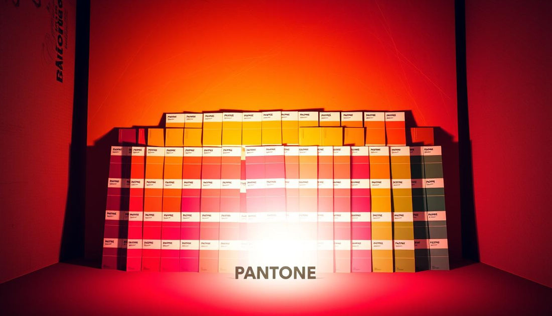
Pantone's Color of the Year program has been a driving force in the design world for over two decades, influencing trends across fashion, interior design, and product development. Each year's hue selection is not just aesthetically pleasing but also reflects broader cultural movements and societal moods.
The shade chosen for the year becomes a historical marker of our collective experience. For instance, Classic Blue in 2020 and the dual selection of Ultimate Grey and Illuminating in 2021 told the story of our evolving design sensibilities and emotional responses to world events.
Understanding the history behind these iconic tones provides insight into how color psychology influences consumer preferences and design decisions. Ametra, specializing in cutting-edge project management and top-tier color solution products, highlights the significance of these colors in shaping contemporary trends.
The Legacy of Pantone and Color Innovation
The Pantone Color of the Year program, launched in 1999, has become a pivotal moment in the design calendar, shaping trends and inspiring creativity. With its 25th anniversary marked by the selection of Peach Fuzz for 2024, it's an opportune moment to reflect on Pantone's legacy and its impact on color innovation.
What is Pantone and Why It Matters
Pantone is a renowned authority on color, providing a universal language for color communication. Its Color of the Year program has become an eagerly anticipated annual event, influencing design trends across various industries.
The Birth of the Color of the Year Program
The Color of the Year program began with Cerulean Blue in 1999. Since then, it has evolved into a significant cultural moment, with a secretive committee analyzing global trends to select a color that reflects the current socio-economic climate.
The selection process involves a thorough analysis of global trends in fashion, art, entertainment, and socio-economic conditions. As noted by Pantone, "The Color of the Year is more than just a shade; it's a reflection of our cultural zeitgeist."
"The Color of the Year is more than just a shade; it's a reflection of our cultural zeitgeist."
| Year | Color of the Year | Significance |
|---|---|---|
| 1999 | Cerulean Blue | Inaugural Color of the Year, setting the stage for an annual tradition. |
| 2024 | Peach Fuzz | Marks the 25th anniversary, representing a quarter-century of influencing design trends. |

As Pantone continues to shape the conversation around color and design, its influence extends beyond the design community, impacting consumer behavior and cultural trends. To continue reading about Pantone's iconic colors and their influence on trends, explore the subsequent sections.
How Pantone Colors Influence Design Trends
Pantone's Color of the Year has become a significant influencer in design trends across various industries. Incorporating the Color of the Year into home decor may start with simple accents like throw pillows, rugs, or artwork, gradually influencing broader design choices and color palettes.

The Cultural Impact of Pantone's Color Selections
Pantone's Color of the Year has a profound cultural impact, reflecting and influencing societal trends. The chosen hue resonates through various aspects of culture, from interior design to fashion.
From Fashion to Interior Design: Pantone's Reach
The influence of Pantone's Color of the Year extends from fashion to interior design, impacting the way designers create spaces and products. It shapes the aesthetic of rooms and interiors, with designers incorporating the colour year into their work to keep it fresh and relevant.
To continue reading about Pantone's influence on design, explore how these trends shape our living spaces.
Pantone's Most Famous Colors Through the Years
Over the years, Pantone has unveiled a range of iconic colors that have left a lasting impact on design and culture. These colors have not only influenced design trends but have also become a significant part of the cultural conversation.
Methodology Behind Popularity Rankings
The popularity of Pantone's Color of the Year is determined through a combination of factors, including social media engagement, article mentions, and consumer behavior. For instance, 2024's Colour of the Year, Peach Fuzz, has been shared 46k times and mentioned in 2,800 articles since its reveal, indicating a significant level of interest and engagement.
Social Media Impact on Color Trends
Social media platforms have become crucial in measuring public reception to Pantone's annual color selections. Hashtags like #pantonecoloroftheyear generate significant engagement, with Instagram serving as a visual showcase for creative applications of these colors. Sentiment analysis of social media conversations reveals that colors like Classic Blue (2020) receive overwhelmingly favorable reactions.
- Social media platforms measure public reception to Pantone's color selections, with hashtags generating significant engagement.
- Instagram showcases creative applications of Pantone colors, with interior designers and fashion influencers sharing their interpretations.
- Sentiment analysis reveals which colors generate the most positive emotional responses.
- Pinterest boards offer insights into how consumers plan to incorporate these colors into their homes and wardrobes.
- TikTok has emerged as a platform where younger demographics engage with color trends through creative challenges and DIY projects.
By analyzing social media conversations and article mentions, it becomes clear that Pantone's Color of the Year has a significant impact on design trends and cultural conversations. As we continue to explore Pantone's most famous colors, it's essential to understand the role of social media in shaping their popularity.
Classic Blue: The Crown Jewel of Pantone Colors
The tranquil essence of Classic Blue has resonated with people worldwide, making it a staple in interior design. This soothing Pantone colour has become a favorite among homeowners and designers alike.
Want to add this tranquil hue to your own space? Start by introducing Classic Blue in small doses. Add a playful, coastal feel to the cosy areas of your home, like a quiet reading nook or breakfast corner.
Why It Resonated Worldwide
Classic Blue's universal appeal lies in its ability to evoke a sense of calm and serenity. It's a color that works well in various design contexts, from modern to traditional.
Incorporating Classic Blue in Modern Design
For a bolder approach, make an Art Deco-inspired statement in the living room with a blue fabric sofa. Here are some expert tips on incorporating Classic Blue into your design:
- Interior designers recommend introducing Classic Blue through statement furniture pieces like sofas or accent chairs.
- The color pairs beautifully with neutrals like crisp white, warm beige, or soft gray.
- In contemporary homes, Classic Blue works well as a ceiling color, adding architectural interest.
- Textural variations allow the color to create different moods and effects within the same space.
- For those hesitant to commit to large blue elements, textiles like throw pillows or area rugs offer a lower-risk way to incorporate this enduring hue.
To give you a better look at how Classic Blue can be used, here's a comparison table:
| Design Element | Classic Blue Application | Effect |
|---|---|---|
| Sofa | Blue fabric | Creates a focal point |
| Accent Chair | Blue velvet | Adds sophistication |
| Ceiling | Blue paint | Adds architectural interest |
As the colour year selection for 2020, Classic Blue continues to inspire designers and homeowners. To continue reading about Pantone's iconic colors and their influence on design, explore the other sections of this article.
Living Coral: A Celebration of Vibrancy
The introduction of Living Coral as Pantone's Color of the Year was a celebration of vibrancy and warmth in design. This lively shade brings a sense of playfulness and energy to any space, making it a favourite for those looking to create a welcoming and cheerful atmosphere in their home.
To incorporate Living Coral into your decor, try pairing it with white and neutral tones to let it take the spotlight. Alternatively, couple it with similar colors like salmon pink or terracotta to create a sun-kissed effect that is warm and inviting, ideal for living spaces as well as the dining area.
The Meaning Behind the Color
Living Coral, as the Pantone Colour of the Year, symbolizes warmth and vitality. It's a color that evokes feelings of joy and optimism, making it perfect for spaces designed for social interaction.
Living Coral in Contemporary Spaces
Interior designers embraced Living Coral as an accent color that instantly energizes neutral spaces, particularly through decorative accessories like vases, throw pillows, and artwork. The color works exceptionally well in social spaces like living rooms and dining areas, where its warmth and vibrancy encourage conversation and connection.
| Design Element | Living Coral Application | Effect |
|---|---|---|
| Accent Color | Vases, throw pillows, artwork | Energizes neutral spaces |
| Social Spaces | Living rooms, dining areas | Encourages conversation and connection |
| Material Pairing | Natural woods, rattan, brass | Creates a current and timeless feel |
To continue reading about incorporating Pantone colors into your design, it's clear that Living Coral pairs beautifully with trending materials like natural woods, rattan, and brass, creating spaces that feel both current and timeless. For maximum impact with minimal commitment, designers recommend incorporating the color through botanical elements like flowering plants or coral-hued florals.
The Power of Duality: Ultimate Grey and Illuminating
In a bold move, Pantone chose a dual color combination, Ultimate Grey and Illuminating, as the Color of the Year for 2021. This pairing brought together two distinct elements: the resilience and stability of Ultimate Grey, and the hope and positivity symbolized by Illuminating, a bright and cheerful yellow.
The First Dual Color Combination Since 2016
Ultimate Grey and Illuminating scored 77 out of 100, securing the third spot in our list, thanks to the 149,487 Instagram posts celebrating their synergy. This dynamic duo, though not to everyone's taste, generated significant interest with 120k Google searches upon its release in December 2020.
Balancing Strength and Optimism in Design
Designers across various fields embraced this versatile color combination. Interior designers used Ultimate Grey as a neutral base and Illuminating as an energizing accent, particularly in home offices and productivity spaces, achieving a balance between focus and creativity. The combination's appeal lay in its ability to bring energy and positivity to spaces, resonating with people looking for inspiration.
- Interior designers applied the combination to create engaging spaces, leveraging Ultimate Grey for stability and Illuminating for vibrancy.
- Fashion designers used color blocking, patterns, and accessories to create visual interest through the contrast between grey and yellow.
- Product designers incorporated the duo into various products, from kitchen appliances to tech accessories, often using grey for the body and yellow for interactive elements.
To continue reading about Pantone's iconic colors and their influence on design, explore the subsequent sections.
Greenery: Bringing Nature Indoors
Greenery, the 2017 Pantone Color of the Year, brought a breath of fresh air into home interiors with its invigorating presence. This vibrant yellow-green hue symbolized renewal and rejuvenation, perfectly capturing the essence of nature indoors. With a massive 27k monthly Google searches, its popularity highlights its ability to breathe life into interiors, offering a fresh and invigorating atmosphere.
When it comes to living spaces, Greenery is perfect for injecting a burst of energy, whether through accent pieces, indoor plants, or bold feature walls. Interior designers continue to incorporate Greenery through both color and actual plant life, creating spaces that feel fresh, alive, and connected to nature.
The Symbolism of Greenery
Greenery symbolizes renewal and rejuvenation, reflecting a desire to reconnect with the natural world. This Pantone colour represents growth and harmony, making it a sought-after choice for those looking to bring a sense of balance into their home.
Greenery's Enduring Appeal in Home Decor
The enduring appeal of Greenery in home decor can be attributed to its versatility and the sense of vitality it brings to spaces. It pairs beautifully with natural materials like wood, stone, and rattan, reinforcing its connection to organic elements and sustainable design practices. As we continue reading about Pantone's Color of the Year selections, it's clear that Greenery's influence extends beyond a single year, evolving into a staple in many design palettes.
| Design Element | Greenery's Impact |
|---|---|
| Accent Pieces | Adds a burst of energy |
| Indoor Plants | Creates a fresh and alive atmosphere |
| Feature Walls | Brings a bold statement |
Ultra Violet: Mystique and Creativity
Incorporating Ultra Violet into your home decor is a statement of creativity and individuality. This bold and rich hue has the power to transform any room into a space that exudes mystique and sophistication.
Ultra Violet can transform a space, lending a unique and original quality to your home. When set against lighter colors, this bold hue truly stands out, creating a striking visual contrast.
The Spiritual Qualities of Ultra Violet
The spiritual qualities of Ultra Violet are profound, often associated with creativity, luxury, and wisdom. Interior designers have embraced this Pantone Colour for clients seeking dramatic, personality-filled spaces that break from conventional color schemes.
- The color works exceptionally well in spaces dedicated to creativity and self-expression, such as home studios, meditation rooms, or reading nooks.
- Ultra Violet creates striking focal points when used for upholstered furniture pieces like velvet sofas or statement chairs, particularly against neutral backgrounds.
Making a Statement with Purple Tones
For added drama, consider incorporating brass and velvet accents to enhance Ultra Violet's richness and edge. Whether featured in a statement wall, furniture, or accessories, Ultra Violet brings a touch of sophistication and creativity to any room.
As the Colour Year of 2018, Ultra Violet continues to inspire designers and homeowners alike to push the boundaries of conventional design. To explore more about incorporating Pantone colors into your decor, continue reading our expert tips.
Rose Quartz and Serenity: Breaking Color Traditions
In 2016, Pantone introduced a revolutionary Color of the Year selection that challenged traditional color norms. Rose Quartz and Serenity, a soft pink and a calming blue, were chosen together, marking the first time Pantone selected two colors.
The combination of Rose Quartz and Serenity was significant because it brought together traditionally gendered colors, challenging perceptions and promoting balance. Serenity, described by Pantone as a cool blue color that "comforts with a calming effect, bringing feelings of respite and relaxation even in turbulent times," paired perfectly with the soft, warm tone of Rose Quartz.
The First Dual Color Selection
This dual selection coincided with a cultural shift toward more inclusive and gender-neutral attitudes. By presenting pink and blue as complementary rather than oppositional, Pantone made a statement about evolving social attitudes.
Challenging Gender Norms Through Color
The impact was seen across various industries. The fashion industry created collections that blurred traditional gender boundaries, while children's product manufacturers expanded their color palettes to be more inclusive.
| Industry | Impact of Rose Quartz and Serenity |
|---|---|
| Fashion | Designers created gender-neutral collections, blending traditional gender boundaries. |
| Children's Products | Manufacturers offered more inclusive color options, moving beyond traditional gendered palettes. |
| Home Decor | The soft, approachable nature of both colors broadened their appeal across demographics. |
To continue reading about Pantone's influential color selections and their impact on design trends, explore the subsequent sections of this article.
Viva Magenta and Very Peri: The New Generation
Viva Magenta and Very Peri, the latest Pantone colors, are redefining the future of design. These innovative hues reflect the evolving intersection of digital and physical worlds.
Creating New Colors for a New Era
Very Peri is a futuristic-feeling color that illustrates how color trends in the digital world manifest in the physical world and vice versa. The metaverse concept significantly influenced these selections, as designers began creating for both physical and virtual environments simultaneously.
Digital Influence on Physical Color Trends
The growing influence of digital aesthetics on physical design is evident, with colors from gaming and social media inspiring real-world applications. This shift is part of the Pantone colour evolution, giving us a new look at color.
Continue reading to explore more about Pantone's iconic colors and their impact on design trends.
Peach Fuzz: The 25th Anniversary Selection
As Pantone celebrates a quarter century of predicting the Colour of the Year, 2024's selection, Peach Fuzz, marks a significant milestone. This 25th anniversary is not just a celebration of a quarter century of color forecasting but also a testament to Pantone's enduring influence on design and culture.
Peach Fuzz has garnered significant attention since its reveal, with 46,000 shares and 2,800 articles mentioning it over the past four months. The social sentiment analysis reveals that 66% of the mentions have been positive, while 33% have been neutral or negative.
The Significance of Peach Fuzz in 2024
The selection of Peach Fuzz as the Colour of the Year for 2024 represents a moment of reflection on the evolution of Pantone's Color of the Year program. Over the years, the program has grown from an industry tool to a cultural phenomenon that influences consumer behavior and design trends worldwide.
Celebrating a Quarter Century of Color Forecasting
Pantone's 25 years of color forecasting have accurately captured pivotal cultural moments, from Cerulean Blue in 1999 to Classic Blue in 2020. Design historians note that the program has documented shifting aesthetic preferences, from the minimalism of the early 2000s to the maximalist tendencies of recent years. As Leatrice Eiseman, Executive Director of the Pantone Color Institute, notes, "The Color of the Year program has become a significant cultural touchstone, reflecting and influencing design and consumer behavior."
- The 25th anniversary selection highlights Pantone's ability to maintain cultural relevance through changing design landscapes and technological revolutions.
- Over a quarter century, Pantone's Color of the Year has evolved, influencing global conversations and consumer behavior.
- The program has documented the shift in aesthetic preferences over the years, from minimalism to maximalism.
- The anniversary selection acknowledges the impact of social media on color trends, with platforms like Instagram and TikTok accelerating the dissemination and adoption of new colors.
Continue reading to explore more about Pantone's iconic colors and their influence on design trends.
Mocha Mousse: Redefining Brown for 2025
Mocha Mousse, the latest Color of the Year from Pantone, is all about embracing comfort and indulgence in our living spaces. This mellow brown shade reflects a desire for nourishment and simple pleasures in life, such as enjoying morning coffee or sharing a chocolate treat with others.
As we continue reading about the trends shaping our homes and interiors, it becomes clear that Mocha Mousse is making a significant impact. Interior designers are embracing this warm, earthy tone for its ability to create cozy, enveloping spaces that feel both grounding and indulgent, perfect for post-pandemic home environments.
From Humble to Luxurious: Brown's Evolution
The versatility of Mocha Mousse allows it to work exceptionally well in various spaces, from bedrooms and reading nooks to kitchen and dining areas, enhancing the sense of comfort and culinary pleasures. At times, this colour year choice by Pantone is seen as a nod to the comforting qualities of brown, elevating it from a humble tone to a luxurious one.
The Comfort and Indulgence of Mocha Mousse
Mocha Mousse pairs beautifully with both warm and cool tones, making it a versatile choice for interiors. Textile designers are incorporating this hue in plush fabrics like velvet, bouclé, and cashmere, emphasizing the sensory comfort associated with the colour. This approach creates a sense of warmth and coziness in the home, aligning with the current design trends.
How to Incorporate Pantone Colors in Your Home
Pantone's annual color selection offers a unique opportunity to revitalize your home's aesthetic. By incorporating the latest Pantone color into your design, you can give your space a fresh and trendy vibe.
Expert Tips from Interior Designers
Interior designers recommend starting with small accents like throw pillows or rugs in the Pantone color to add a pop of trends to your room. This approach allows you to test the color without making a significant commitment.
Balancing Trendy Colors with Timeless Design
To achieve a balance between trendy and timeless, pair the Pantone color with classic elements. For example, you can use the Pantone color for accessories while keeping your furniture neutral. This way, you can easily update your space with the latest Pantone colour without compromising your overall design.
Some key considerations include the architectural style of your home and the context in which the color will be used. For a colour year like the one chosen by Pantone, it's essential to think about how it will be perceived in your daily life. If you're ready to explore more design ideas, continue reading about the latest trends.
The Psychology Behind Pantone's Color Selections
The psychology behind Pantone's Color of the Year choices reveals a deep understanding of cultural and emotional nuances. Pantone's selections are not just aesthetically pleasing colors but are rooted in the cultural and emotional context of the time.
Pantone's Color of the Year reflects the current cultural climate, capturing the essence of the moment. For instance, in color psychology, green represents harmony, balance, and restoration—qualities that resonated during periods of political and social division. According to color theory, Ultimate Grey represents resilience and stability, while Illuminating, a bright and cheerful yellow, symbolizes hope and positivity.
Cultural Reflections and Emotional Impact
Colors chosen by Pantone evoke different emotional responses, influenced by both universal and culturally conditioned factors. Research in color psychology confirms that our emotional responses to colors are complex, affecting how we perceive and interact with our environments.
- Blues and greens, such as Classic Blue and Greenery, typically evoke feelings of calm and security, making them particularly effective during times of social and political turbulence.
- Warm colors like Living Coral and Illuminating stimulate energy and optimism, explaining their selection during periods requiring collective motivation and positivity.
- Dual selections like Rose Quartz/Serenity and Ultimate Grey/Illuminating acknowledge the complexity of emotional responses during transitional periods, offering balanced psychological benefits.
- The tactile qualities associated with colors create multisensory experiences that deepen our emotional connections to our surroundings.
The Emotional Resonance of Color Choices
The emotional impact of Pantone's Color of the Year selections is profound, influencing how we experience and interact with our environments. By understanding the psychology behind these choices, we can better appreciate the role of color in shaping our feelings and perceptions.
To continue reading about Pantone's influence on design and culture, explore more articles on their iconic colors and the impact on various industries.
Ametra: Your Source for Professional Pantone Color Solutions
Ametra is committed to providing professionals with the most accurate and reliable color matching tools. Our Pantone Color Guides are designed to ensure precise color reproduction, allowing designers to trust that their work will be represented as intended. Whether you're working on a house beautiful project or a complex design challenge, our guides are an indispensable resource.
Expanding Color Solutions for Design Professionals
We're not just stopping at traditional color guides. Ametra is expanding its offerings to include innovative digital color measurement tools and software, fostering creativity in the design process. Our upcoming colorimeter products will enable designers to capture and match colors from any physical surface, effectively bridging the gap between inspiration and implementation.
- Developing specialized color solutions for specific industries, including fashion, interior design, and architectural applications.
- Ametra's color management software will integrate with leading design programs, creating seamless workflows for professionals working across multiple platforms.
- Our team of color experts provides consultation services for businesses seeking to develop custom color palettes or implement consistent color standards across their brand.
To continue reading about our innovative solutions and how they can enhance your design projects, stay tuned for more updates from Ametra.
Conclusion: The Enduring Influence of Pantone's Iconic Colors
From Classic Blue to Viva Magenta, Pantone's iconic colors have left an indelible mark on the world of design and beyond. Over the years, the Color of the Year program has evolved into a cultural phenomenon, influencing design decisions across multiple sectors and resonating with millions worldwide.
Pantone's most famous colors have transcended their respective years to become enduring elements in the design lexicon. They serve as historical markers, capturing specific cultural moments and emotional climates. As Pantone celebrates 25 years of color forecasting, its ability to identify colors that resonate with collective experiences demonstrates the profound connection between color and human emotion.