
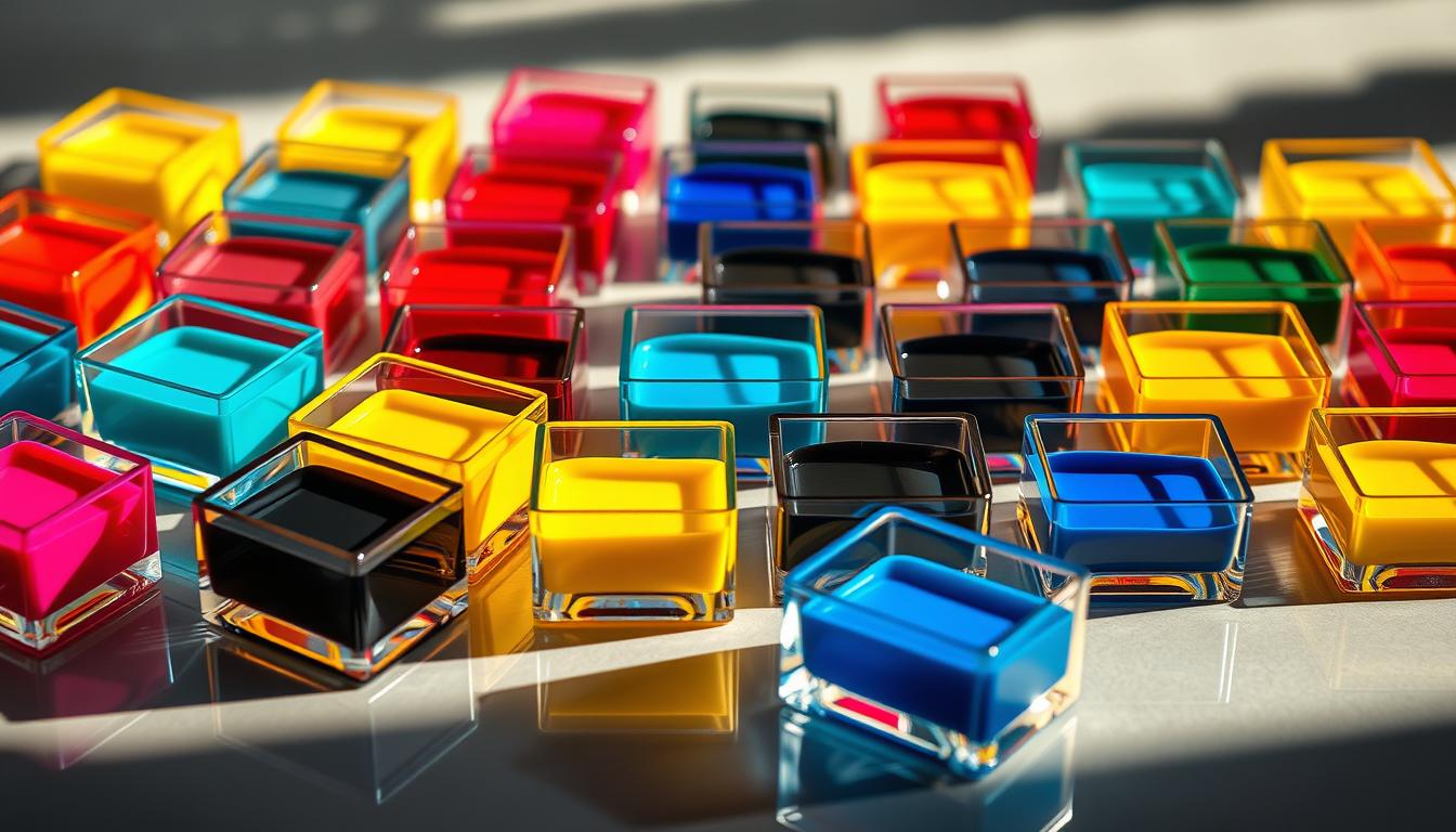
Creating eye-catching visuals starts with mastering color combinations. Whether you’re designing a logo, planning a space, or crafting a campaign, the right palette sets the tone. The Pantone Formula Guide, with 1,800+ spot colors, ensures print accuracy—making it the gold standard for professionals.
Understanding the color wheel and harmony principles helps evoke emotions and reinforce brand identity. Think of Zoom’s calming blue or Apple’s sleek monochrome—strategic choices that resonate globally.
Today’s tools, like Adobe Color, simplify palette creation, while seasonal trends keep designs fresh. Ready to transform your design approach? Let’s dive in.
The Science Behind Color Combinations
Sir Isaac Newton’s discovery revolutionized how we perceive and use hues. In 1666, he created the first color wheel, laying the groundwork for modern color theory. This simple circle reveals how shades interact, guiding designers to create balanced palettes.
How the Color Wheel Dictates Harmony
The wheel organizes hues into three groups:
- Primary colors: Red, blue, and yellow—the building blocks that can’t be mixed from others.
- Secondary: Green, orange, and purple, made by blending two primaries (e.g., red + yellow = orange).
- Tertiary: Hues like blue-green or red-violet, created by mixing a primary with a secondary.
Tools like Figma’s palette generator simplify this process. Drag sliders to see how adjusting ratios changes a hue’s intensity.
Primary, Secondary, and Tertiary Relationships
Think of a sunset: warm reds and yellows evoke energy, while cool blues feel calming. This temperature contrast is key to visual impact.
Designers also navigate two systems:
- RGB (additive): Uses light (screens) where red + green + blue = white.
- CMYK (subtractive): Uses ink (print) where cyan + magenta + yellow = near-black.
Understanding these differences ensures your work looks flawless everywhere.
Why the Pantone Formula Guide Matters
Ever wonder how Coca-Cola’s red stays the same worldwide? The Pantone Formula Guide makes it possible. With 1,800+ pre-mixed spot colors, it’s the gold standard for exact matches across prints, fabrics, and screens.
The secret? The PMS numbering system. Each shade, like "Pantone 185 C" for Coca-Cola, has a unique code. This ensures every vendor—from printers to painters—uses identical ink formulations.
Spot colors (Pantone) differ from process printing (CMYK). Pre-mixed inks guarantee color accuracy, while CMYK blends four inks for broader ranges. For brands, spot colors prevent drift—like McDonald’s golden arches or Tiffany’s blue box.
Industries relying on Pantone compliance:
- Packaging: Ensures cereal boxes match store displays.
- Corporate branding: Logos stay consistent on business cards and billboards.
- Fashion: Designers match fabrics to seasonal palettes.
Physical swatch books remain vital for tactile matching. Yet digital tools, like Coolors’ Adobe extension, integrate Pantone libraries seamlessly. Both uphold the Guide’s mission: perfection in every hue.
Understanding Color Psychology in Design
Colors speak louder than words, shaping emotions and decisions in seconds. Whether it’s a brand logo or a hospital wall, hues silently influence moods and actions. This is color psychology at work—a tool designers wield to craft unforgettable experiences.
Dark Blue: The Universal Symbol of Trust
Dark blue isn’t just a shade—it’s a strategy. Financial giants like Chase Bank use navy in their branding to evoke sense of stability. Zoom’s iconic background follows the same playbook, fostering calm during virtual meetings.
Contrast this with Tiffany’s robin-egg blue, which whispers luxury. Yet, the same hue in hospitals promotes tranquility. Context transforms perception.
Lime Green: Energy in Every Pixel
Spotify’s neon accents pop against dark interfaces, injecting playfulness. This lime green choice mirrors youthfulness and creativity—perfect for a music platform. It’s a vibrant counterpoint to corporate blues.
| Color | Western Meaning | Eastern Meaning |
|---|---|---|
| White | Purity, weddings | Mourning, funerals |
| Red | Love, urgency (e.g., McDonald’s) | Luck, prosperity |
McDonald’s red-and-yellow combo isn’t accidental. Warm tones stimulate appetite—a trick fast food chains have used for decades. Meanwhile, tech brands lean on blues and greens to balance innovation with reliability.
How to Master Color Combinations for Brand Consistency
Strategic use of shades ensures your brand stands out in a crowded market. Whether you’re designing a logo or planning a campaign, the right palette can make your brand instantly recognizable and memorable.
Using Complementary Colors for Contrast
Complementary colors, like red and black, create high contrast and make each hue pop. Netflix’s iconic red against a black background is a perfect example. This pairing not only grabs attention but also reinforces brand recognition.
However, overusing high-contrast pairings can overwhelm the viewer. Balance is key. Use tools like Adobe Color to test and refine your palette for maximum impact.
Monochromatic Schemes for Subtlety
Monochromatic color schemes use variations of a single hue to create depth and consistency. Apple’s space gray product lineup is a prime example. This approach exudes sophistication and reinforces brand identity through subtle variations.
When designing for accessibility, ensure contrast ratios meet guidelines. For example, buttons should have a 4.5:1 contrast ratio for legibility. This ensures your design is inclusive and user-friendly.
Finally, always convert your palette between CMYK and RGB for cross-media consistency. This ensures your brand looks the same everywhere, from print to digital.
Pantone’s Role in Precision Color Matching
Pantone has been the cornerstone of precise hue matching since its inception in 1963. Its standardized system ensures that every shade, from logo designs to packaging, remains consistent across industries. This precision is vital for brands aiming to maintain their identity globally.
From Logo Design to Packaging
In the world of branding, consistency is key. Pantone’s ink formulations guarantee that a logo looks the same on a business card as it does on a billboard. For packaging, especially in luxury goods, the system’s ability to reproduce metallics and special finishes is unmatched.
Different materials, like uncoated and coated paper, can alter how a hue appears. Pantone’s guides account for these variations, ensuring accurate color reproduction regardless of the medium. This attention to detail is why brands like Tiffany & Co. and Coca-Cola rely on Pantone.
Modern formulations also include sustainable ink alternatives, reflecting the industry’s shift toward eco-friendly practices. These innovations ensure that precision doesn’t come at the cost of the environment.
“Pantone’s annual Color of the Year influences global design trends, from fashion to marketing.”
Each year, Pantone’s Color of the Year sets the tone for creative industries. From 2023’s Viva Magenta to 2025’s Mocha Mousse, these selections shape branding strategies and consumer preferences worldwide. This cultural impact underscores Pantone’s enduring relevance in design and marketing.
Analogous Color Schemes: Nature’s Blueprint
Nature often inspires the most harmonious designs, guiding us toward balance and beauty. Analogous palettes, which use hues adjacent on the wheel, mimic the seamless transitions found in the natural world. These schemes create a sense of unity and calm, making them ideal for serene and cohesive visuals.
Take National Geographic’s iconic yellow, red, and orange palette. These warm, adjacent hues evoke the vibrancy of a sunset, capturing attention while maintaining harmony. Such palettes are not just visually appealing—they also tell a story, connecting viewers to the essence of the subject.
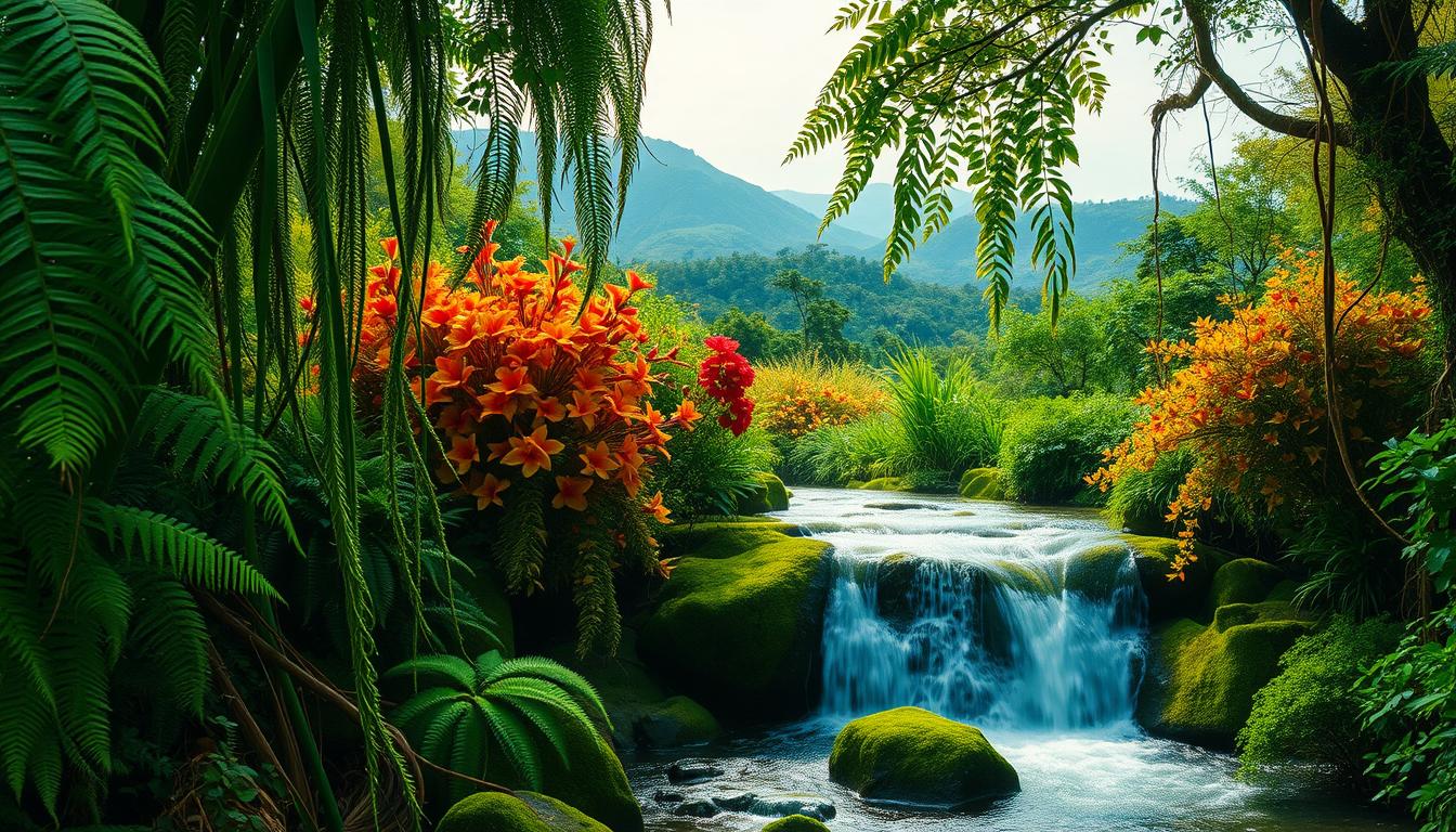
From lush forests to arid deserts, gradients in nature offer endless inspiration. A forest palette might transition from deep greens to earthy browns, while a desert scheme shifts from warm yellows to muted oranges. These transitions create depth and movement, perfect for dynamic designs.
In UI design, a beach sunset palette using five adjacent hues—soft pinks, oranges, and yellows—can evoke warmth and relaxation. However, be cautious of low-contrast accessibility issues. Ensure text remains legible by testing contrast ratios and adding accent colors for visual pop.
Accent colors, like a bold blue in a green-dominated palette, can break monotony and draw attention to key elements. This technique ensures your design remains both harmonious and engaging. By drawing from nature’s blueprint, you can create palettes that feel both timeless and impactful.
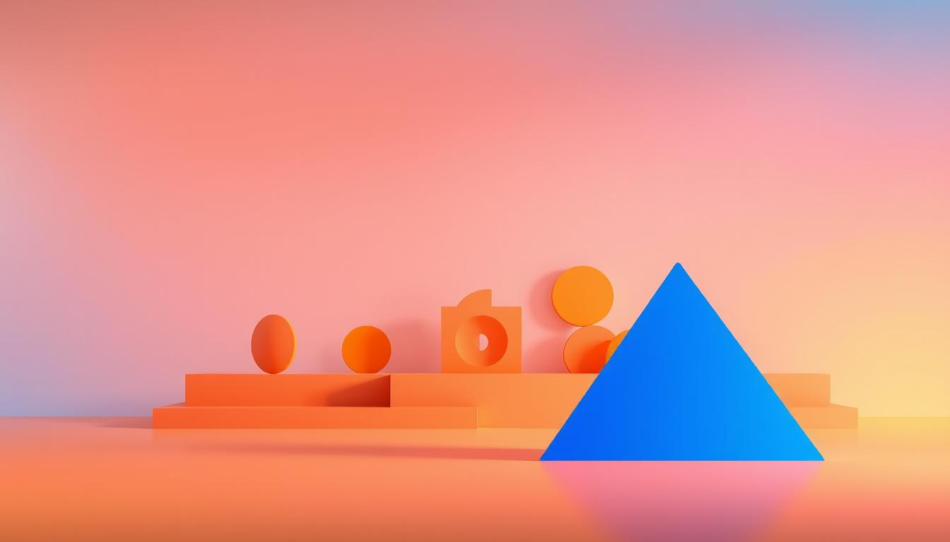
Triadic and Tetradic Palettes for Bold Statements
Bold designs often rely on dynamic palettes to make a lasting impression. Triadic and tetradic schemes are perfect for creating vibrant visuals that stand out. These palettes use three or four hues evenly spaced on the wheel, offering balance and energy.
Take Burger King’s iconic logo. Its triadic scheme of red, yellow, and blue creates a playful yet striking identity. Similarly, Instagram’s gradient uses a tetradic harmony, blending purple, pink, orange, and yellow for a modern, eye-catching look.
To balance these schemes, follow the 60-30-10 rule. Use one dominant hue (60%), a secondary shade (30%), and an accent (10%). Neutral bases like white or gray prevent overwhelming designs while letting vibrant hues shine.
Energy drink brands often use intense triadic palettes to convey excitement. For example, a red, blue, and yellow combo grabs attention on shelves. Adjust saturation to avoid visual fatigue—toned-down versions of these hues can maintain energy without overpowering.
“A well-balanced palette makes bold statements while maintaining harmony.”
Here’s a quick guide to using these schemes effectively:
| Scheme | Example | Best Use |
|---|---|---|
| Triadic | Red, Yellow, Blue | Playful, energetic designs |
| Tetradic | Purple, Pink, Orange, Yellow | Modern, dynamic visuals |
Whether you’re designing a logo or packaging, triadic and tetradic palettes can make your work unforgettable. Experiment with these schemes to create designs that truly pop.
60 Striking Color Combinations for Design Projects
Designing with the right hues can transform any project into a masterpiece. Whether you’re crafting a corporate template, a sports app, or luxury packaging, the palette you choose sets the tone. Below, we explore three standout color combinations that balance aesthetics and functionality.
Stormy Morning: Blue-Gray Professionalism
This palette combines cool blues and soft grays for a polished, professional look. Ideal for corporate templates, it includes hex codes like #87CEEB, #66CDAA, and #4682B4. These shades evoke calmness and reliability, making them perfect for business presentations or branding materials.
Accessibility is key, and this combination scores an impressive 8.5/10. For customization, tools like Coolors.co allow you to tweak the hues to fit your project’s needs.
Electric Fusion: Vibrant Energy
For projects that demand attention, electric blue paired with bold oranges and pinks creates a dynamic effect. Hex codes like #00FFFF, #FF69B4, and #FFD700 bring energy to sports app mockups or event posters.
With an accessibility score of 7.5/10, this color combination ensures readability while maintaining its vibrant appeal. It’s a great choice for designs that need to stand out in a crowded space.
Gothic Noir: Moody Sophistication
Dark maroons, deep browns, and muted purples define this luxurious palette. Hex codes like #000000, #A0522D, and #808080 create a moody, sophisticated look, ideal for luxury cosmetics packaging or high-end branding.
This combination scores an 8.0/10 for accessibility, ensuring it’s both stylish and inclusive.
Creating Visual Hierarchy with Color
Effective design relies on guiding the viewer’s eye with strategic use of hues. By establishing a clear visual hierarchy, you can direct attention to the most important elements. For example, Amazon’s bright orange "Buy Now" button dominates the page, making it an unmissable focal point.
Newspapers use black headlines with bold accents to prioritize information. This approach ensures readers immediately grasp the key stories. Similarly, in UI design, contrast helps differentiate elements, guiding users through the content seamlessly.
Understanding the z-pattern scanning habit is crucial. Users naturally follow this path when viewing a page. By placing key elements along this path, you can enhance engagement. For instance, placing a call-to-action button in the bottom-right corner aligns with this natural flow.
Cultural differences also play a role. In Western cultures, red often signifies urgency, while in Eastern cultures, it symbolizes luck. Tailoring your design to these perceptions ensures your message resonates globally.
Heatmap analysis provides valuable insights into user behavior. Areas with higher interaction rates can be highlighted with brighter hues, while less important sections use muted tones. This approach ensures a balanced and effective visual hierarchy.
- Amazon’s orange button: A prime example of dominance through hue.
- Newspaper layouts: Black headlines with color accents prioritize information.
- Z-pattern scanning: Align key elements with natural eye movement.
- Cultural hierarchy: Red as urgency vs. luck in different cultures.
- Heatmap analysis: Use data to guide design decisions.
By mastering these techniques, you can create designs that not only look great but also guide users intuitively. Whether it’s a website, app, or print material, a well-structured visual hierarchy ensures your message is clear and impactful.
Color Harmony in UI Design
The right palette can transform user experiences in UI design. From calming blues to sleek neutrals, hues play a pivotal role in guiding user behavior and building trust. Let’s explore how industry leaders like Zoom and Apple master this art.
Zoom’s Trust-Building Blue
Zoom’s iconic blue background isn’t just visually appealing—it’s a strategic choice. The hex code #2D8CFF has evolved over time, but its purpose remains the same: to foster calmness and reliability. This trust-building shade aligns with the platform’s mission to connect people seamlessly.
Blue is universally associated with trust and professionalism, making it a go-to for platforms like Facebook and Twitter. Zoom’s use of this hue ensures users feel secure during virtual meetings, even in high-stress scenarios.
Apple’s Minimalist Neutrals
Apple’s minimalist approach to UI design is evident in its dark mode neutrals. Shades like #1C1C1E and #2C2C2E create a sleek, modern aesthetic while reducing eye strain. This palette is consistent across macOS, iOS, and other platforms, reinforcing Apple’s brand identity.
Dark mode isn’t just about aesthetics—it’s functional. By using muted tones, Apple ensures readability in low-light environments, enhancing user comfort. This thoughtful design choice reflects the brand’s commitment to both style and usability.
When comparing Android and iOS system conventions, Apple’s minimalist palette stands out for its simplicity. Android often uses brighter, more varied hues, while iOS sticks to a refined, cohesive scheme. Both approaches have their merits, but Apple’s consistency is unmatched.
“Loading animations and error messages are where UI design meets psychology.”
Loading animations often use calming blues or greens to reduce user anxiety. On the other hand, error messages rely on red to signal urgency. Best practices suggest using #FF0000 sparingly, as overuse can overwhelm users. Instead, pair it with neutral tones for balance.
By mastering trust-building and minimalist palettes, brands like Zoom and Apple set the standard for effective UI design. Their choices not only enhance user experiences but also reinforce brand identity across platforms.
The Emotional Power of Warm vs. Cool Tones
The way we feel about a space or design often starts with the hues we see. Warm tones, like red and orange, evoke energy and excitement. Cool tones, such as blue and green, bring calmness and trust. Understanding this emotional impact helps designers create spaces that resonate with their audience.
Take McDonald’s branding, for example. Their use of red and yellow stimulates appetite and urgency. In contrast, Intel’s blue palette conveys professionalism and reliability. These choices aren’t accidental—they’re strategic decisions that shape how we perceive brands.
In spa websites, aqua and white create a serene atmosphere. These cool tones promote relaxation, making visitors feel at ease. Restaurants, on the other hand, often use earthy tones for warmth or neon hues for a lively vibe. Each choice reflects the desired emotional impact.
Political campaigns also leverage this power. Blue is associated with trust, while red conveys urgency and passion. These warm tones and cool tones influence voter perceptions and decisions.
Even lighting plays a role. Circadian lighting adjusts its temperature throughout the day—cool in the morning for focus and warm in the evening for relaxation. This mimics natural light, enhancing well-being.
| Tone | Emotion | Example |
|---|---|---|
| Warm | Energy, Urgency | McDonald’s Red |
| Cool | Calm, Trust | Intel Blue |
By understanding the emotional impact of hues, designers can craft experiences that connect deeply with their audience. Whether it’s a brand, a space, or a campaign, the right palette makes all the difference.
Pantone’s Ink Formulations for Print Perfection
Achieving flawless prints requires precision in every detail. Pantone’s ink formulations are the backbone of this process, ensuring every hue matches the design vision perfectly. From corporate logos to luxury packaging, these formulations deliver print perfection across industries.
Take PMS 185 C, for example. This iconic red, used by Coca-Cola, consists of 94% magenta and 100% yellow. Such precise ink formulations guarantee consistency, whether printed on a billboard or a business card. Pantone’s system eliminates guesswork, making it the gold standard for professionals.
For luxury effects, Pantone offers metallic ink additives. These create shimmering finishes, ideal for high-end packaging or invitations. Fluorescent inks, on the other hand, add vibrancy but come with safety regulations to ensure they’re non-toxic and eco-friendly.
When comparing offset and digital printing, the color gamut differs significantly. Offset printing uses spot colors for unmatched accuracy, while digital printing relies on CMYK blends. Pantone bridges this gap, offering formulations optimized for both methods.
Another innovation is the Pantone SkinTone Guide. This tool helps designers create realistic portraits by matching skin tones with precision. It’s a game-changer for industries like cosmetics and fashion, where authenticity matters.
“Pantone’s formulations ensure that every print reflects the designer’s intent, from concept to final product.”
Whether you’re working with coated or uncoated paper, Pantone’s system accounts for substrate variations. This attention to detail ensures print perfection across all materials. By mastering these formulations, designers can bring their visions to life with confidence.
Seasonal Color Trends to Inspire Your Palette
Seasonal shifts bring fresh opportunities to refresh your creative palette. From soft pastels in spring to rich earth tones in autumn, seasonal trends offer endless inspiration for designers, marketers, and architects alike. Let’s explore how these trends can elevate your projects.
In 2024, spring palettes lean toward soft pastels like Gummy Pink and Aqua Blue. These hues evoke a sense of renewal and freshness, perfect for branding or interior design. On the other hand, autumn embraces earthy tones like Desert Orange and Mocha Brown, creating warmth and depth in any project.
Holiday campaigns often rely on classic pairings like Target’s red and green. These bold choices create a festive atmosphere while maintaining brand recognition. Similarly, Pantone’s Color Institute forecasts trends that influence industries worldwide, from fashion to web design.
Fashion runways are a treasure trove of inspiration. Designers adapt runway palettes for digital platforms, ensuring consistency across mediums. For example, mossy greens and deep blues from the runway seamlessly transition to web designs, creating cohesive brand experiences.
Sustainability is also shaping seasonal trends. Plant-based dyes and eco-friendly palettes are gaining traction, reflecting a growing commitment to nature. These choices not only look stunning but also align with global efforts toward environmental responsibility.
Whether you’re designing a holiday campaign or refreshing a brand, seasonal palettes offer a wealth of possibilities. By staying attuned to these trends, you can create designs that resonate with your audience and stand the test of time.
Conclusion: Building Your Color Confidence
Building your confidence in choosing the right hues starts with practice and experimentation. Tools like the Pantone Guide, Coolors, and the color wheel are essential for mastering the art of palette creation. Use them to refine your skills and explore new possibilities.
Take inspiration from the world around you. Study nature’s gradients or architectural designs to see how hues work in real-life settings. This field research can spark fresh ideas and deepen your understanding of harmony and contrast.
Consider creating a personal brand system. Document your favorite palettes and test them across different media—print and digital. This ensures consistency and helps you see how hues behave in various contexts.
Finally, don’t fear mistakes. Document failed attempts to learn and grow. Every misstep is a step closer to mastering color confidence. Keep experimenting, and soon, you’ll create palettes that truly resonate.